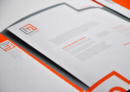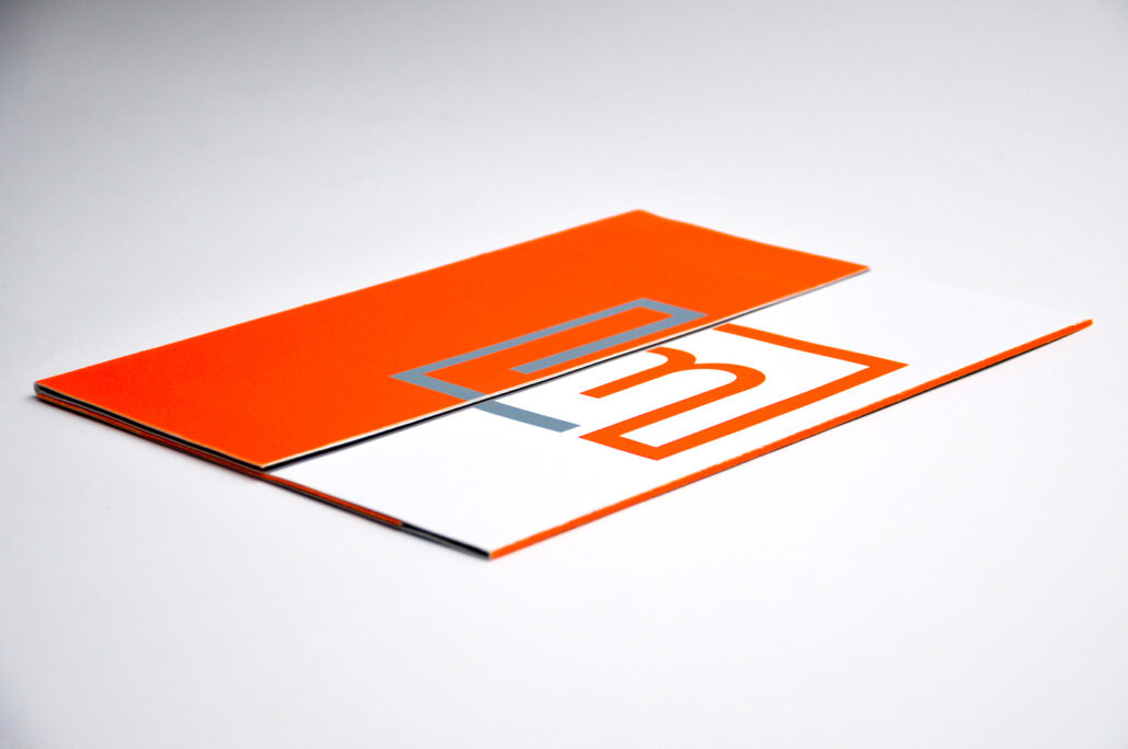
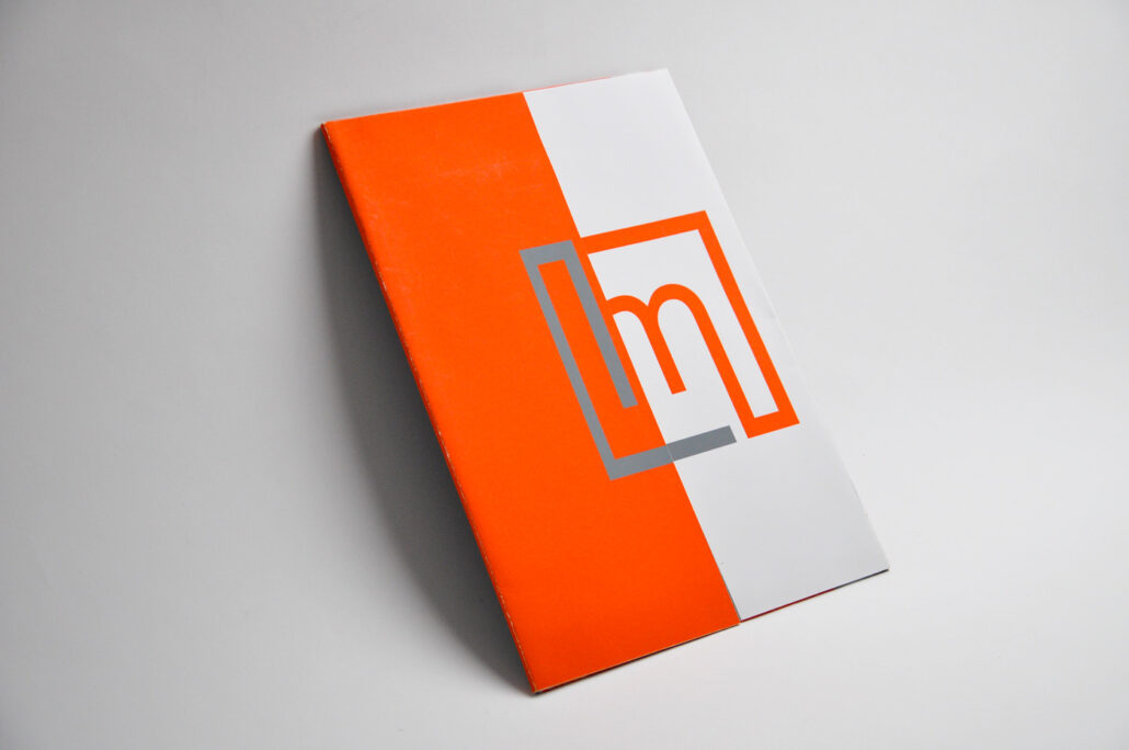
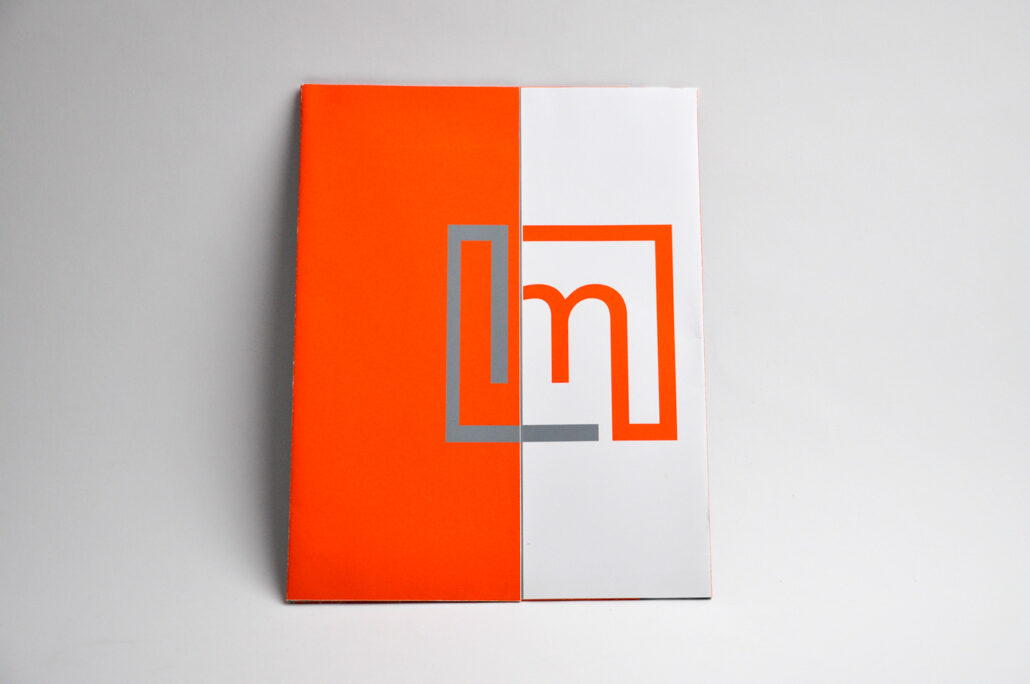

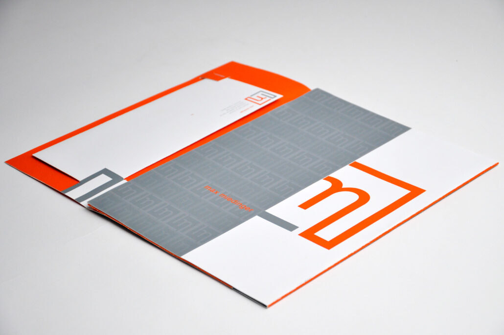
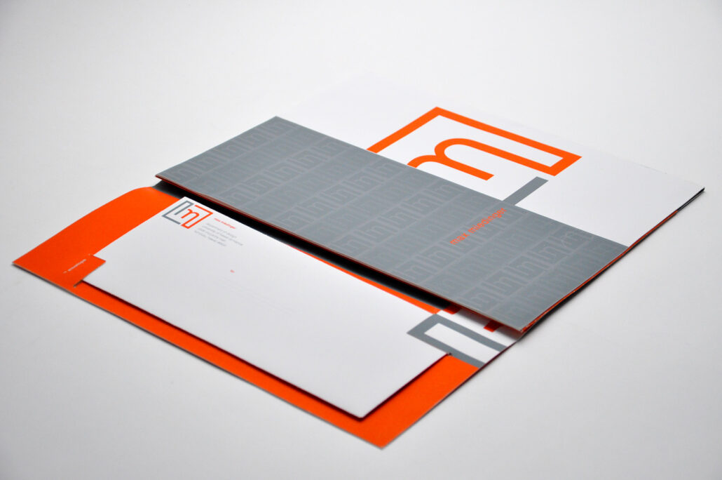

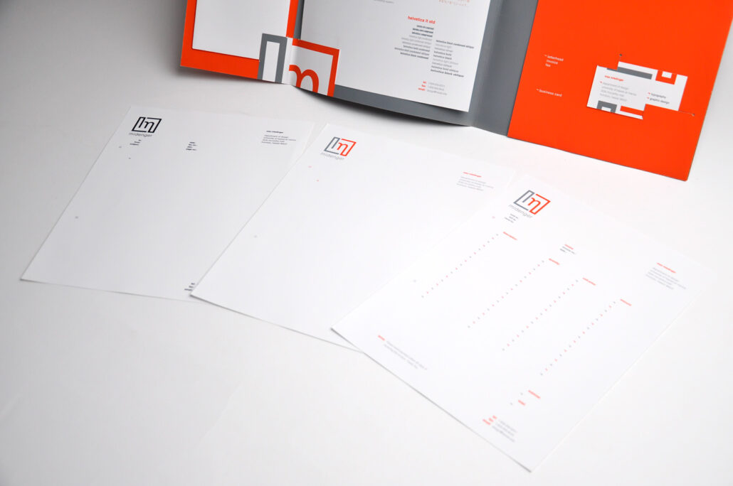
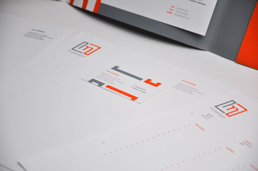
Max Miedinger Identity System
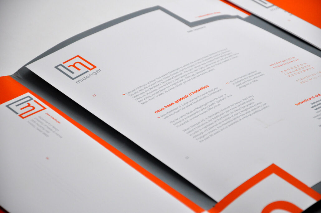
Branding an identity drafted for Max Miedinger, Swiss type designer, using his typeface Helvetica to embody his professional identity. This branding includes stationary materials: invoice, fax, letterhead, envelope, business card housed in a tri-fold folder. Playing off of Helvetica’s neo-grotesque characteristics of tight spacing between letters and dense, compact appearances play into the design and logo form playing off his initials. Clean and concise aesthetics are portrayed the branding with orange and charcoal, showcasing a professional and modern characteristic to a timeless design and identity.
Details
Max Miedinger, renown typographic designer with the HAAS Foundry for his famous typeface Helvetica, currently the most widely used sans serif of the 20th century. Tasked to adapt the existing HAAS Grotesk to modernize the typeface. Neue Haas Grotes released in 1957, Miedinger’s china-ink drawings inspired his work, a new design in its own right rather than an old one with minor retouching. Re-released and re-named Helvetica in 1961, the traditional Latin name for Switzerland (associating the fashion of Swiss typography), wasn’t intended as a family of many weights. The Helvetica family has been added to over the past 30 years and it is the most widely available typeface today.
Dimensions
Folder: 9.125″ x 11.875″ closed.
22.5″ x 11.875″ open.
Envelope: 9.4375″ x 4.5″
Business card: 3.5″ x 2″
Letterhead, Fax, Invoice: 8.5″ x 11″
Date
Student project attending the University of Hawai’i at Manoa. May 2014 – UHM Art 366.